
These Linktree examples all prove the same point: the best link-in-bio pages are not the prettiest ones, they are the clearest ones, a follower lands, understands what you want them to do, and taps in one or two seconds. Below are six example layouts grouped by creator niche, the anatomy they all share, and a step-by-step way to build your own. The goal is not to copy a page but to steal its structure, because structure is what makes a bio link convert instead of just sitting there.
What people mean by "Linktree examples"
When creators search for Linktree examples, they are almost never looking for a gallery to admire. They want two concrete things: proof of what a finished page looks like in their niche, and the reusable pattern behind it so they can build their own without staring at a blank screen. So this guide is built around the second thing. Each example is an archetype, not a real named creator, described so you can see the moving parts and rebuild them on any tool.
One clarification first, because it changes how you read every example. A Linktree page is, by default, a vertical list of buttons. Linktree has added commerce features since (you can sell products, memberships and tips directly from the page, including on the free plan), so it is no longer only bare buttons. But most example pages you will find in the wild are still button lists, and that is the gap worth noticing: for a creator whose whole job is recommending products, a stack of identical grey buttons is the weakest possible format. Keep that in mind as you read.
What every good example has in common
Before the niches, here is the anatomy that the pages that actually convert all share. If you take nothing else from this article, take these five:
- One clear priority at the top. The first thing on the page is whatever the creator most wants clicked right now: a new video, a launch, a live collab. The top of a bio page gets the most taps, so it should not be wasted on a generic "my website" button.
- A few labelled sections, not one long stack. Ten identical buttons are exhausting to scan. Three sections with headings (say: recommendations, latest content, contact) let a follower jump straight to what they came for.
- A reason to tap, per link. A bare button says nothing. A short line of context, a thumbnail or a photo turns "another link" into "oh, I want that."
- The creator's own voice. Labels like "Link 1" or "Click here" read like a placeholder. Real example pages use the creator's words: "the serum I actually repurchase", "my Lisbon coffee list".
- It works on a phone. Every one of these pages is opened from a phone, in the Instagram or TikTok in-app browser. If it is slow, cramped or the images do not load, none of the rest matters.
Six Linktree examples, by creator niche
1. The beauty and skincare creator
The strongest beauty pages lead with recommendations, because that is what the audience came for. The top section is a short set of product cards ("my everyday base", "the SPF I never skip"), each with the creator's own photo and a click-to-copy promo code. Below that sits a "latest video" link and their other socials. What makes it work: the products are not a boring list of shop links, they look like a friend's recommendations, and there is no price on show to create hesitation. The whole page reads as "here is what I use", which is exactly the buying mindset.
2. The lifestyle and travel creator
A travel page is usually organised by theme rather than by product: "my camera gear", "Lisbon city guide", "what's in my bag". Each theme is a small section, and inside it are a few recommendations plus maybe a blog post or a saved highlight. The lesson here is grouping: a travel creator recommends dozens of things, so without sections the page becomes an unreadable wall. Labelled themes turn that same content into something a follower can actually navigate.
3. The fitness coach
Fitness pages tend to have a single dominant call to action (a program, a coaching waitlist, a free plan PDF) sitting right at the top, followed by supporting links: the supplement they recommend, their workout playlist, their socials. This is the "one priority" principle in its purest form. The coach knows the one thing they want clicked, so it goes first and large, and everything else is deliberately secondary.
4. The tech and gadget reviewer
A tech reviewer's page is a recommendation engine: "my desk setup", "best budget mic", "the laptop I switched to". These are ideal card candidates, because a spec-heavy purchase is exactly the kind where a creator's short honest take ("great mic, but skip the bundled arm") does the persuading. A plain button linking to a product page carries none of that; a card carries all of it.
5. The food and recipe creator
Food pages usually mix content and products: "this week's recipe", "the pan I use in every video", "my spice shelf". The winning move is keeping content and recommendations in separate sections so the page does not feel like one long shopping list. Followers came for a recipe, and the tools they can buy sit right underneath, discovered naturally rather than pushed.
6. The multi-platform creator
Some creators are everywhere: YouTube, a newsletter, a podcast, plus affiliate recommendations. Their page is really a hub, and the risk is that it becomes a link graveyard. The examples that survive this ruthlessly prioritise: the current focus at the top, socials grouped into one tidy row, and recommendations kept to the few that actually earn, rather than every link they have ever shared.
The upgrade most example pages are missing
Look across all six and one pattern repeats: the pages that convert do not treat every recommendation as a button. They treat it as a small pitch. That is the single upgrade most Linktree examples never make, and it is worth seeing concretely.
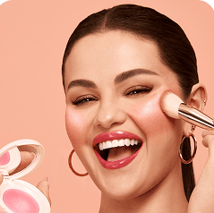 -10%
-10%Rare Beauty
Soft Pinch Blush
“My everyday blush, one sweep and it lasts all day.”
The difference is not cosmetic. A button asks a follower to trust a grey label and click into the unknown. A card gives them your photo, your words and a code before they leave, which is what makes them tap. Spotilink is built entirely around this format: every recommendation is a hand-made card, there is 0% commission on your affiliate earnings (it is not a store, so there is no sale to skim), the stats you see are clicks so you know which cards actually pull, and the custom URL is included on the free plan. The trade-off worth stating once: if you need a full digital-product checkout, a broader hub fits better; if your work is recommending products, a card-first page is the most direct tool. If that sounds like your page, here is the fuller case for a card-first Linktree alternative.
From example to your own page in 15 minutes
You do not need to redesign anything from scratch. Pick the archetype closest to you above, then follow the same five moves any good example uses: choose your one bio link, group your links into a few labelled sections, turn recommendations into cards rather than buttons, put your most important link first, and test it on a real phone before you promote it. That is the whole method, and it is why a focused page beats a long one every time.
If you are still weighing tools, it helps to know what Linktree actually is and how it compares to the alternatives before you commit, our rundown of the best Linktree alternatives covers the free-forever options. If you would rather just start, here is how to create a link-in-bio page for free, and the complete link in bio guide for the full walkthrough.
The best example page is the one built for what you actually do. If your bio is mostly product recommendations, cards beat buttons: your photo, your honest take and a click-to-copy code give followers a reason to tap, with 0% commission on your affiliate earnings and the custom URL free. Build yours in about 15 minutes.